
Redesign Project
Kwa-Velile Primary School
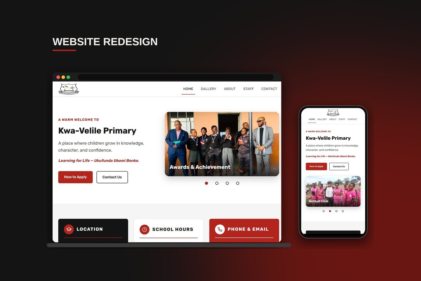
Overview
Kwa-Velile Primary is a no-fee school in KwaCoka, Lusikisiki, Eastern Cape, serving Grade R through Grade 7. The school already had a website, but it was hard to use on a phone, its colours had drifted from the school's own, and it was costly and awkward to keep up to date. I was brought in to redesign it: same school, same content, but a clearer structure, a stricter identity, a phone-first layout and a better way for staff to manage it.
The Brief
The school needed somewhere to introduce itself to families and the wider community.
The audience
Mostly parents, often on a phone.
What it had to cover
Its mission, its staff, what the school year looks like, and how to apply.
The limits
The budget was small, and the site had to be simple enough for school staff to keep up to date without a developer.
The Original Site
I started by going through the existing site page by page, the way a parent would, looking for where it got in the way.
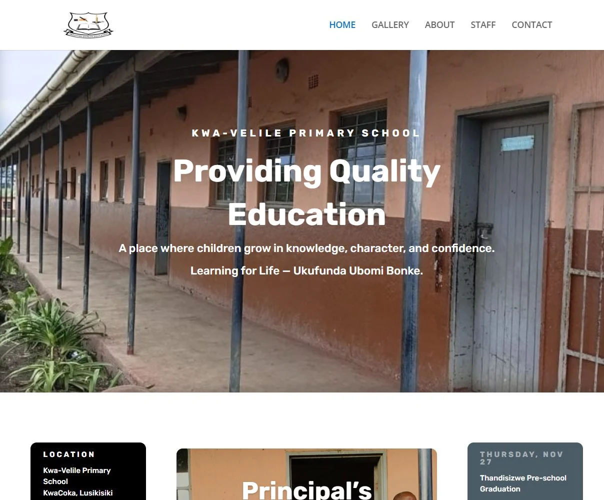
Original The homepage as I found it
What wasn't working
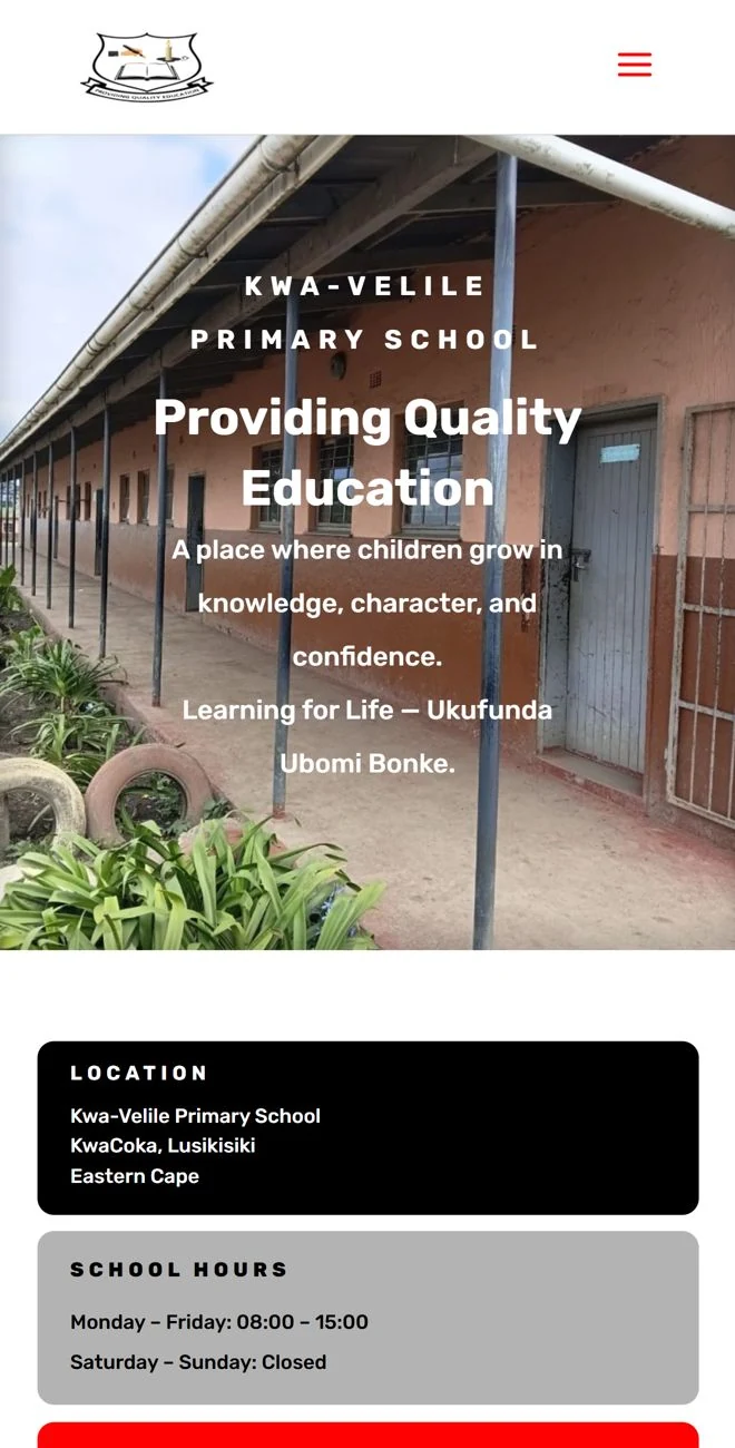
It was not very phone friendly.
Most families visit on a phone, but text sat on top of the photo and the hero felt crowded on a small screen.
The colours had drifted from the school's.
Purple and orange had crept into the staff cards and slate blue into the About page, none of which belong to the school.
The home page had no clear next step.
A full-width photo with text on top looks fine in a mock-up, but a parent arriving with one question had nothing to press.
The gallery behaved like a blog post.
It showed an author, a date and a comment form above a collage of very small thumbnails.
Pages didn't feel like one family.
Headings, cards and buttons each followed slightly different rules from page to page.
It was heavy to maintain.
It ran on WordPress with a recurring hosting subscription, which is a lot for a school with a small budget and no developer.
Redesign Goals
I set four goals for the redesign, and every decision after this traces back to one of them.
One identity, strictly
Red, black and white only, with a single typeface. If a colour isn't one of the school's, it doesn't appear.
Answer the parent's question first
Where is the school, when is it open, how do I apply, how do I reach someone? The answers should be visible without scrolling or searching.
Real people, not stock
The school's own learners, staff and events carry the pages. The design's job is to frame them, not compete with them.
Easy for staff to keep alive
A school calendar changes every term. The design should make updating events, photos and staff simple for the people who actually do it.
Planning the New Structure
The original structure was already built around what a parent looks for, so I kept that idea and sharpened it. The biggest change is that the things every family needs, the essentials, the calendar and how to apply, now live on the home page instead of being hunted for.
Site map
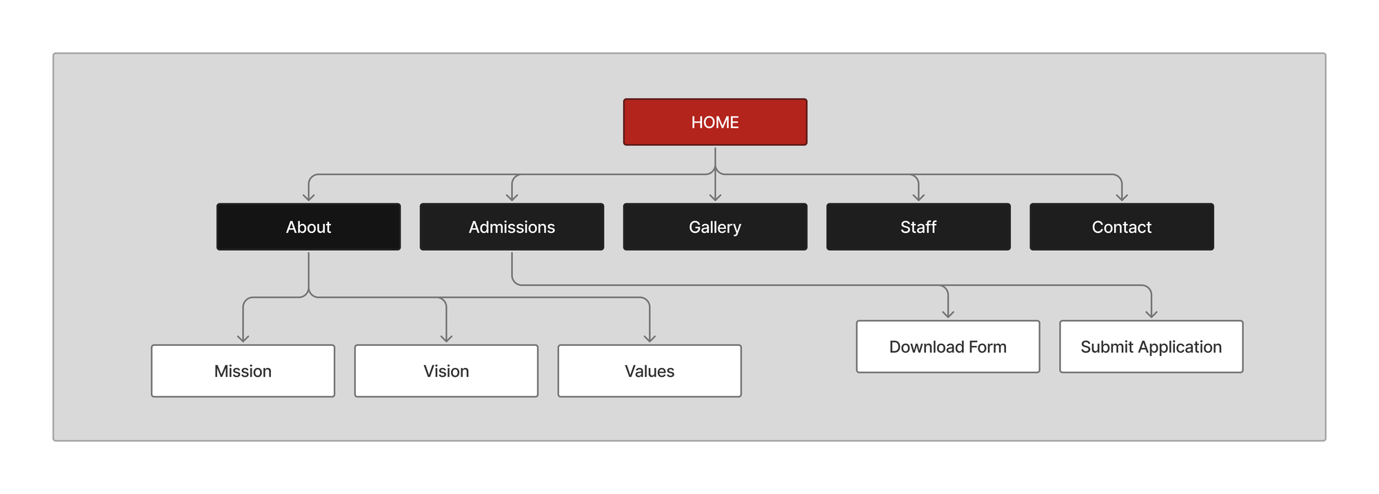
Every page also has a footer with the location, school hours, phone and email.
How a parent moves around
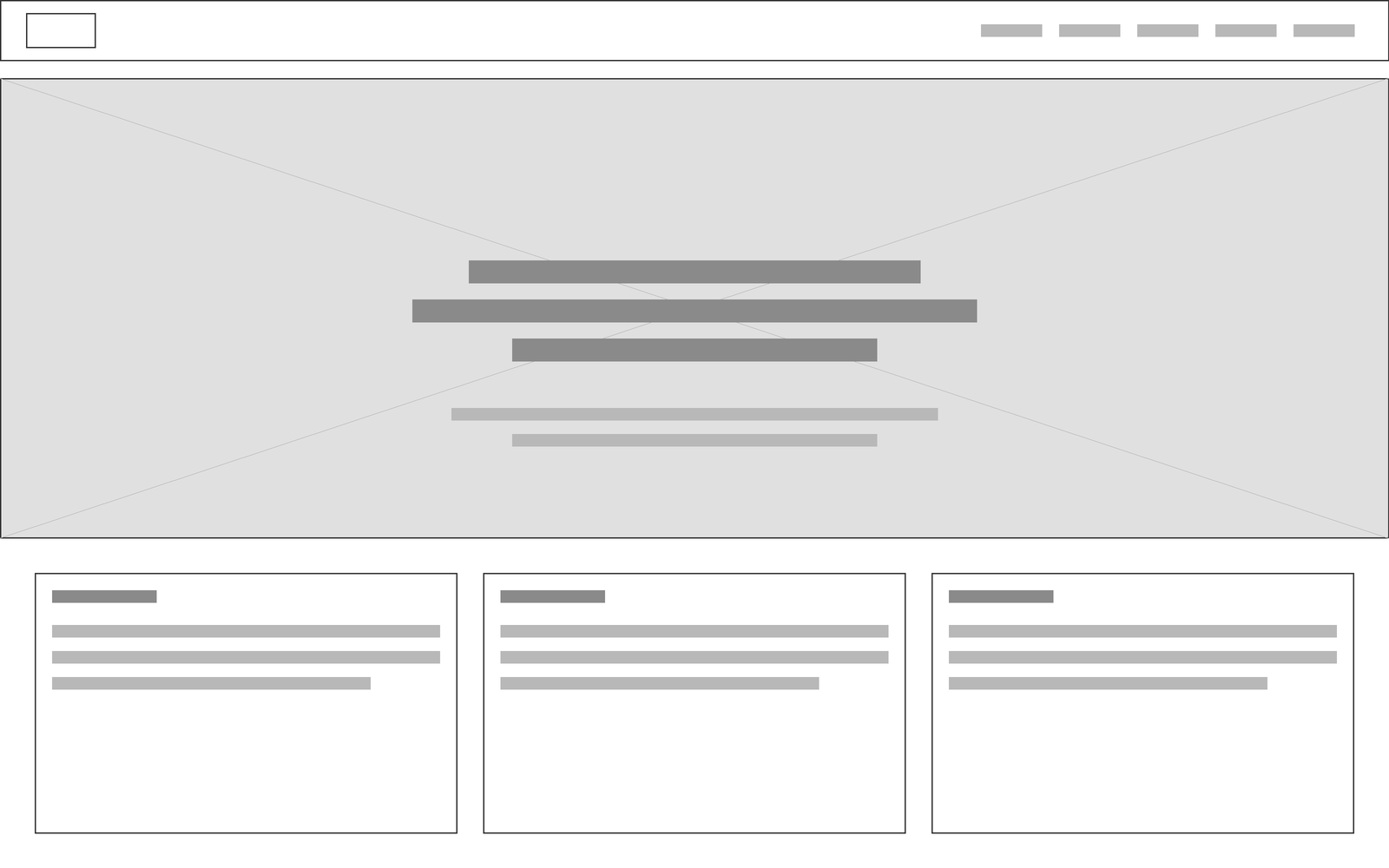
The home page does most of the work. A parent can start the application, check dates or reach the school without leaving it.
How to Apply button
Calendar section
Contact Us button
Also on Home
Home page layout
Visual Identity
The palette comes straight from the school's crest: red, black and white. The redesign applies it more strictly than the original did. Red marks anything you can act on or that matters, black gives weight to information, and white and light grey give the pages room. The crest and its "Providing Quality Education" motto anchor every page.
Typography
Site Typeface
Aa Bb Cc Dd Ee Ff Gg Hh Ii Jj Kk Ll Mm Nn Oo Pp
Aa Bb Cc Dd Ee Ff Gg Hh Ii Jj Kk Ll Mm Nn Oo Pp
What changed
Why
Pure red, grey and black boxes became the school's own red, black and white.
The crest is the school's identity. Using only its colours makes every page read as the same school.
A decorative heading font gave way to a single typeface.
One clean typeface is easier to read on a small screen and keeps the pages feeling like one family.
Designing the Key Moments
A home page that tells you what to do
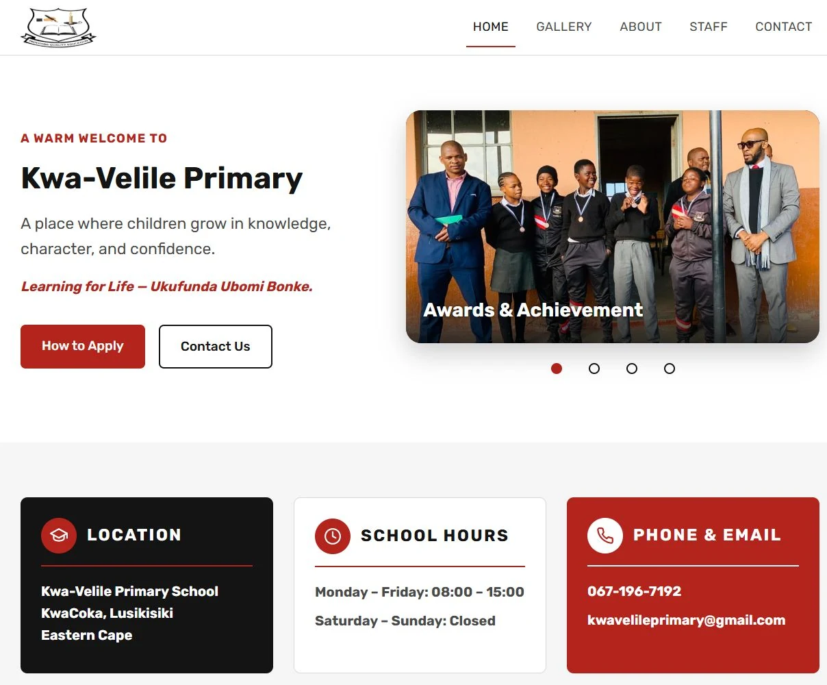
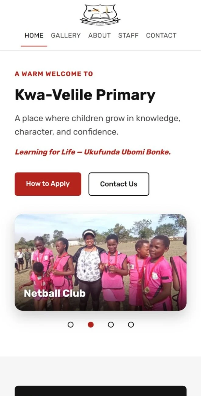
The full-width photo gave way to a split layout: a short welcome, the school motto and two buttons, "How to Apply" and "Contact Us", beside a slideshow of real learners.
What changed
Why
Text over a full-width photo became a welcome, two buttons and a slideshow side by side.
A parent arriving with one question had nothing to press. Now the next step is the first thing they see, and the photos still carry the warmth.
The essentials, as three cards
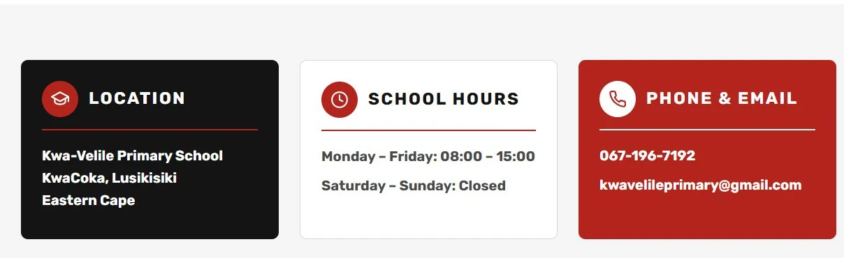
Location, school hours and contact details sit right under the hero as three cards: one black, one white, one red.
What changed
Why
The same three details moved from the Contact page to the home page.
They are the three things every parent looks for, so they should not take a second click to find.
Pure red and grey boxes became black, white and the school's red.
This is where the palette's rules first show: black for information, red for the way to reach the school.
A calendar families can actually use
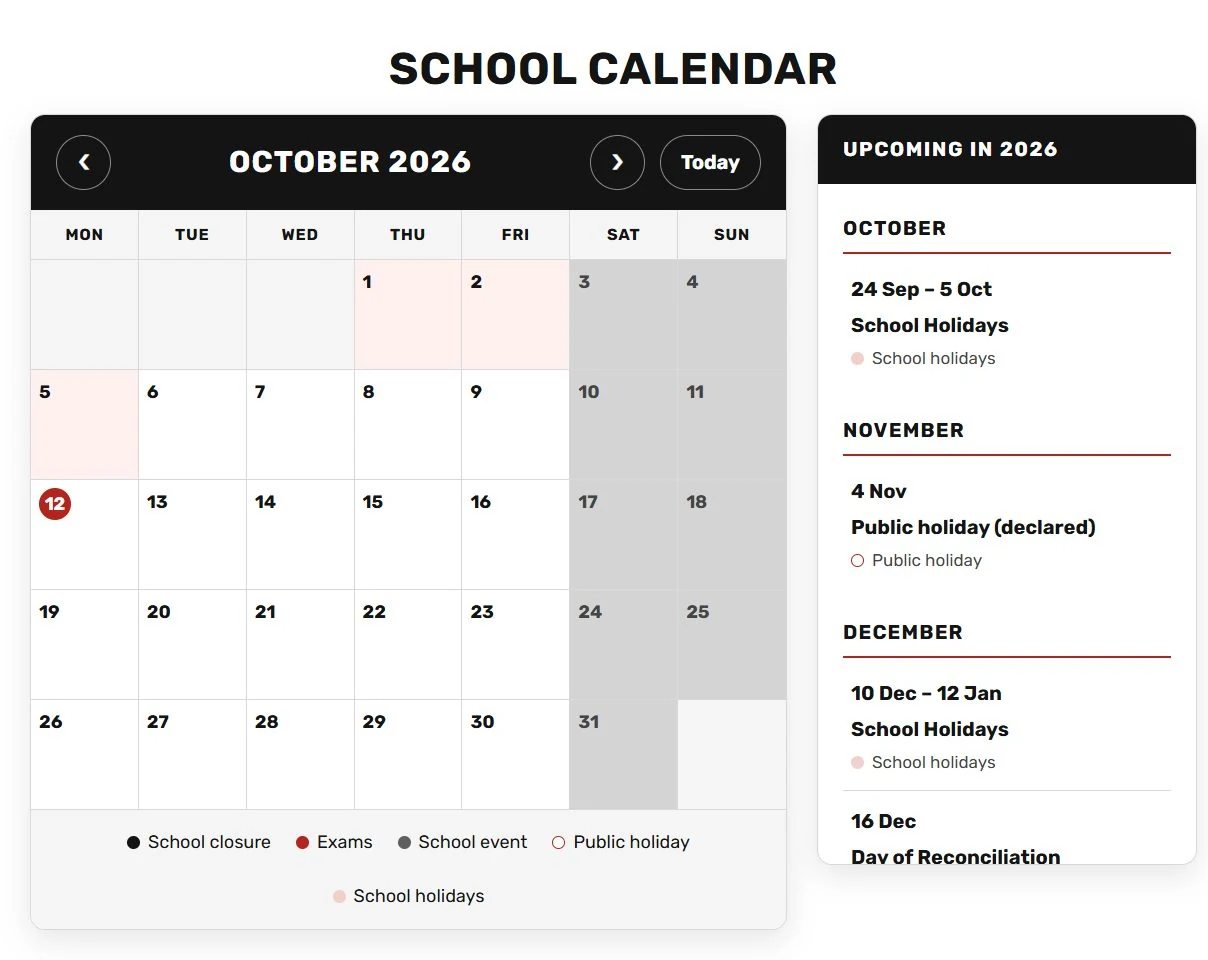
South African public holidays and school terms are already marked, school holidays are shaded across their days, and a list beside it shows what's coming up for the rest of the year.
What changed
Why
A plain events list became a month view with a list of what's coming.
Families plan around terms and holidays. Seeing them on a calendar answers "when is the school open?" at a glance.
Choosing an event jumps the calendar to that day.
Nobody has to count squares to find the date.
Applying, in three steps
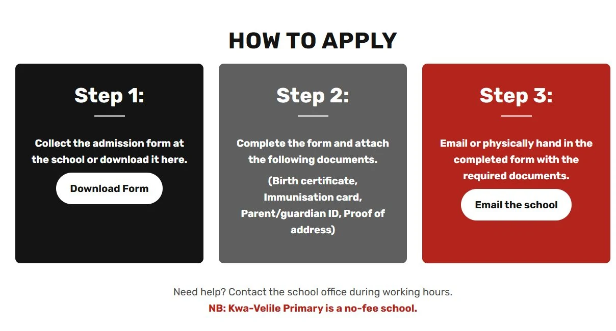
Admissions became three large, numbered steps with a button on each: collect the form, complete it with the documents, hand it in.
What changed
Why
Admissions information became three numbered steps, each with a button.
Admissions is the most important job the site has. Steps are easier to follow than paragraphs, especially on a phone.
A single line underneath says it is a no-fee school.
It answers the question most families have before they read any further.
Page by Page: Before & After
The same pages, the original on the left and the redesign on the right, each with what changed and why.
About
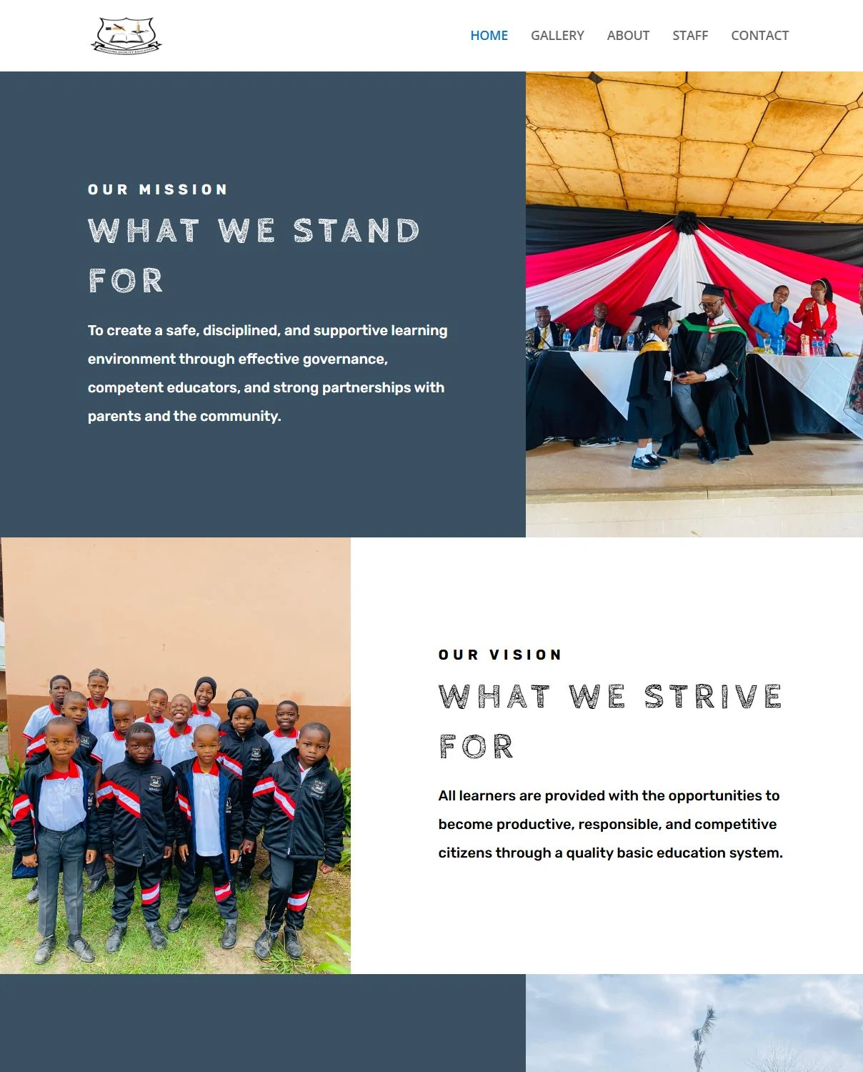
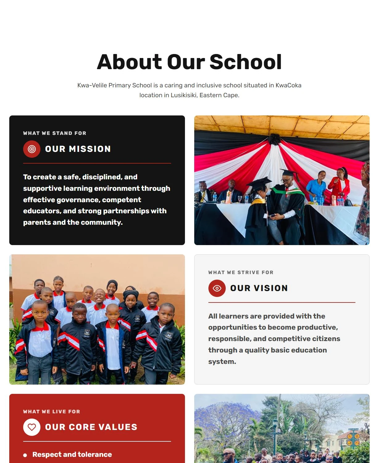
What changed
Why
Slate-blue blocks became cards in the school's colours.
Slate blue was never one of the school's colours, and it made the page feel like a different site.
Long blocks of text became three short cards, each with an icon.
Parents skim. Three short cards answer "what does this school stand for?" faster than a long page.
Staff
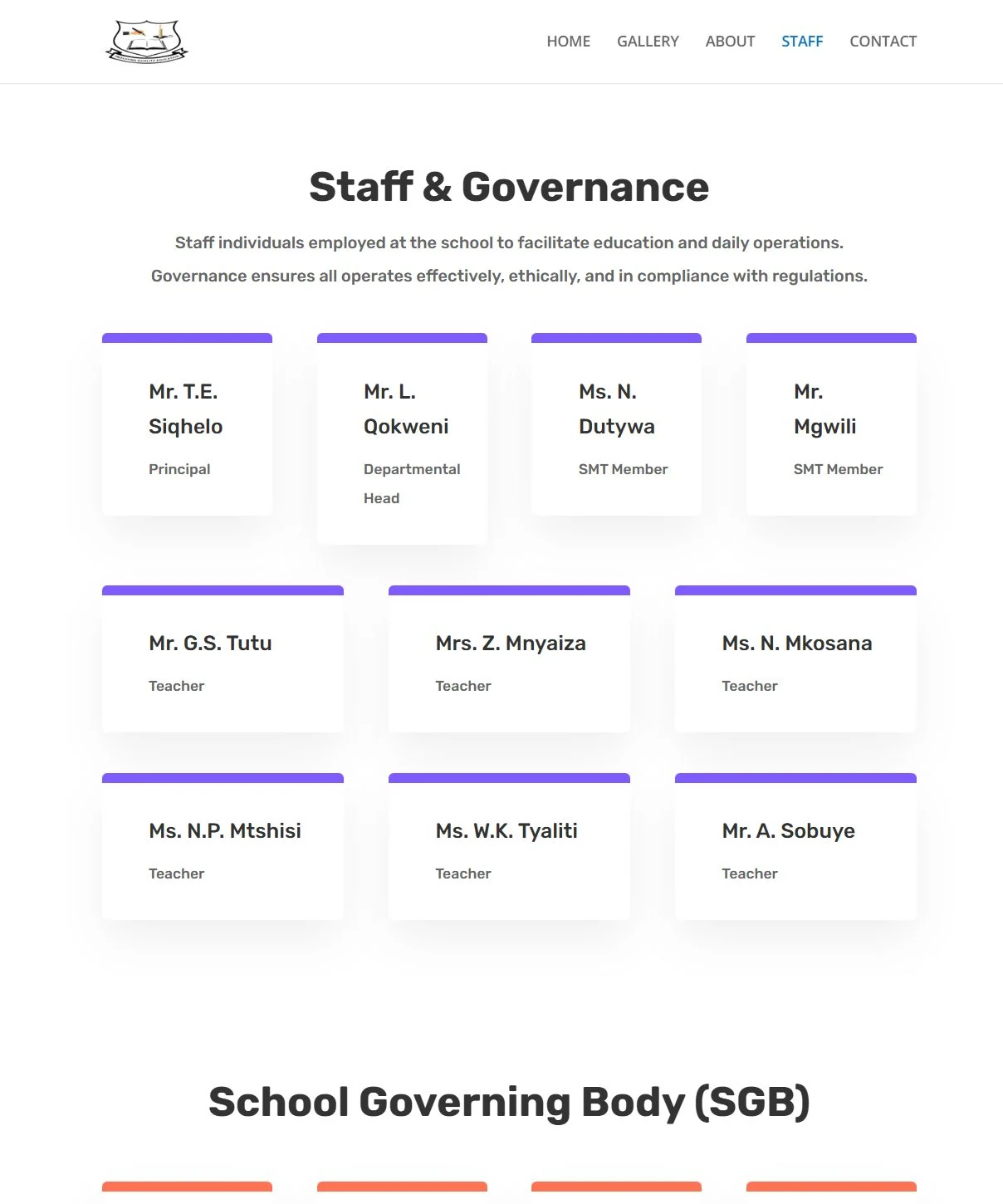
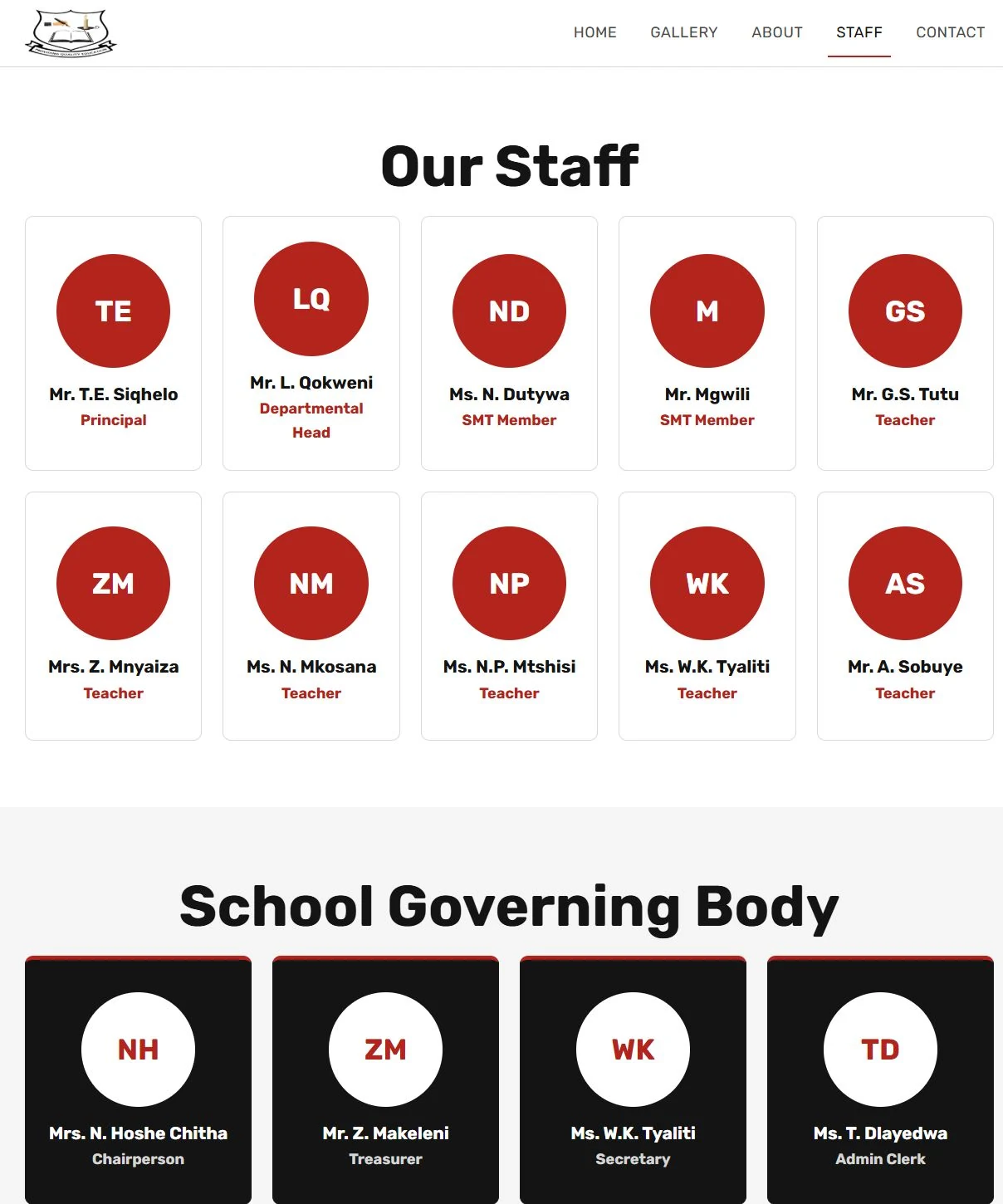
What changed
Why
Purple and orange cards became the school's palette.
Those colours did not belong to the school and clashed with every other page.
Uneven rows became balanced rows, with initials for each person.
Even rows treat every staff member equally, and initials keep the cards consistent when a photo isn't available.
The governing body is set apart in black.
It is a different group from the teaching staff, and the page should show that without extra explanation.
Gallery
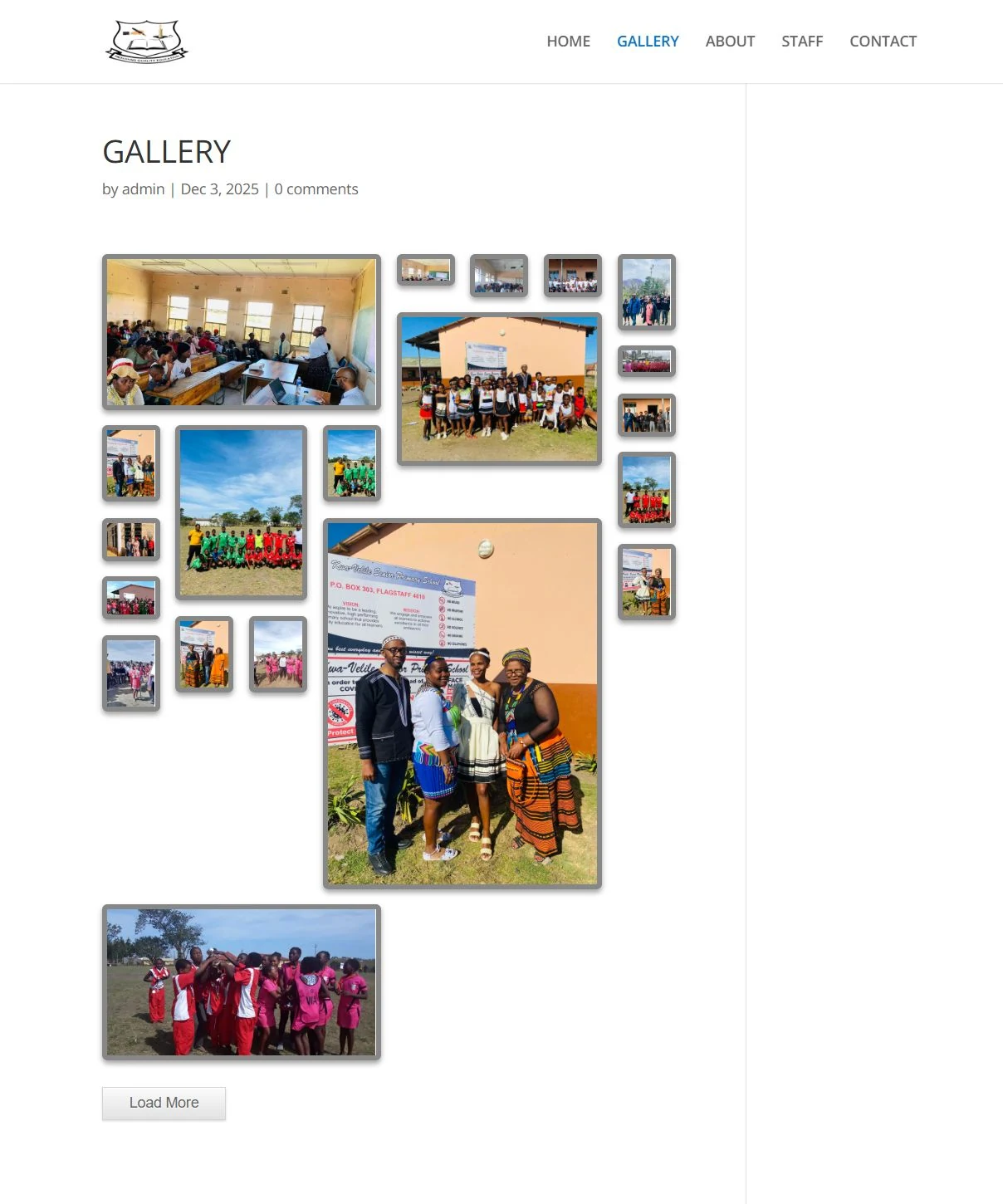
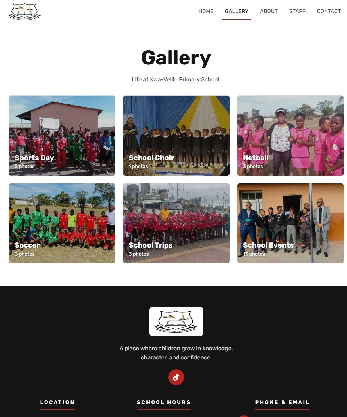
What changed
Why
The author, date and comment form were removed.
A school gallery is not a blog. Those details added clutter and gave visitors something to fill in that nobody would read.
A collage of tiny thumbnails became six album cards with photo counts.
Albums let families go straight to the event they care about, and larger photos let them actually see their children.
Contact
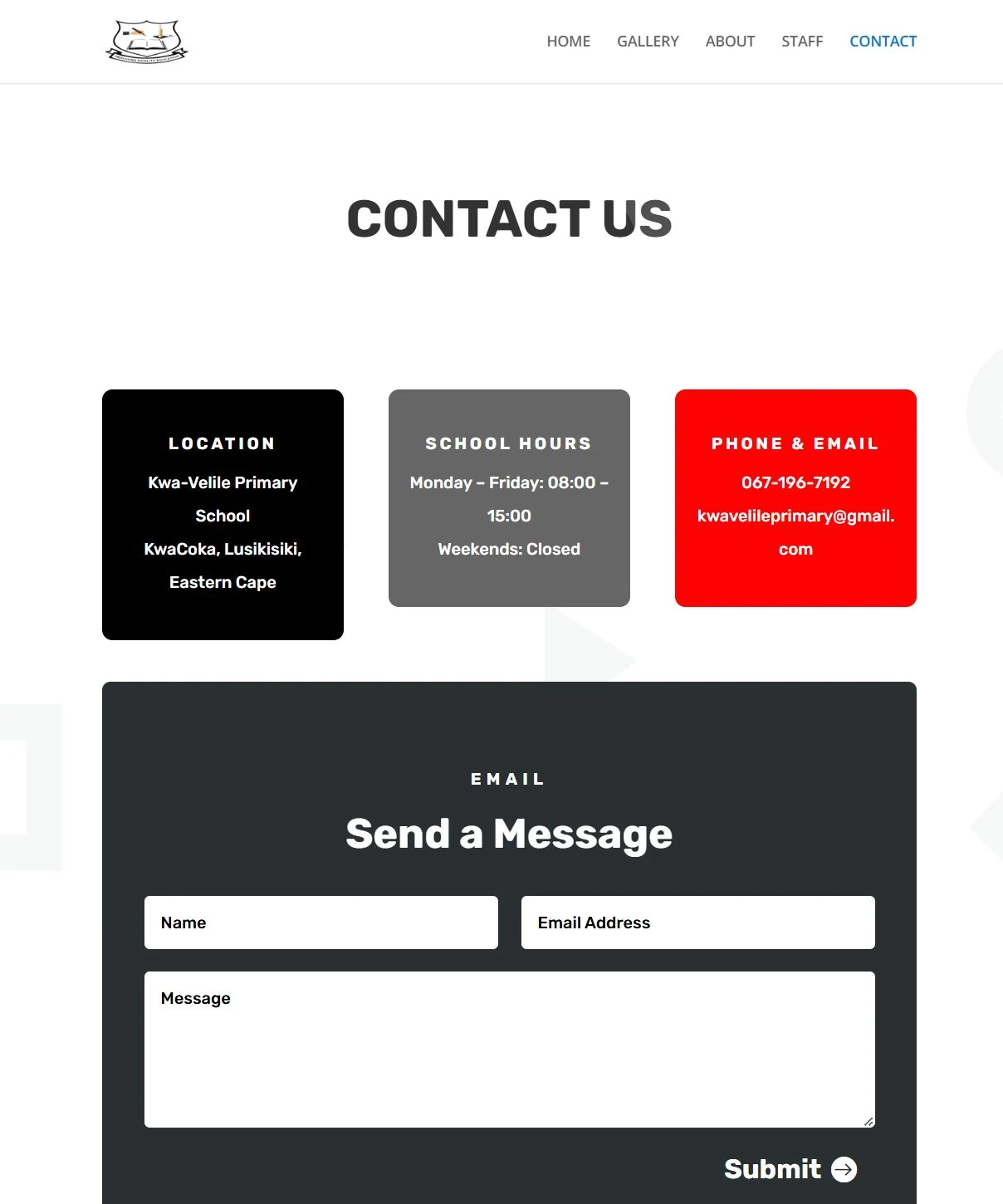
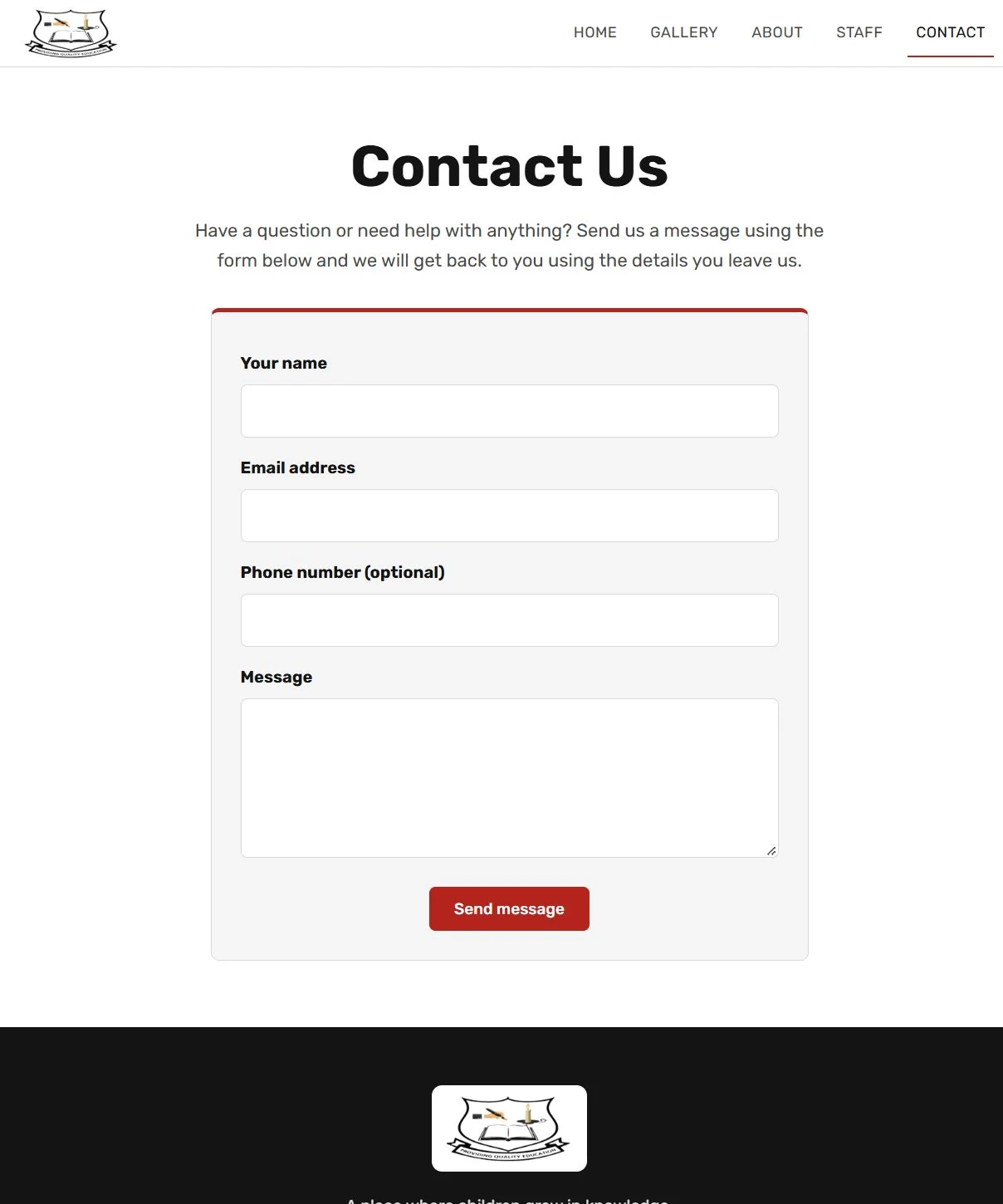
What changed
Why
The three coloured boxes moved off this page: to the home page cards and to a footer on every page.
The school's details should be one glance away from any page, not only from the Contact page.
The email address in the old boxes broke across two lines. Now it sits on one line in the footer.
An address split in two is easy to misread and awkward to copy.
Labels now sit above each field instead of inside it, and there is a short intro line.
Labels inside a field disappear once you start typing. A clear label and a welcoming line make the form easier to complete.
An optional phone number field was added.
Many families would rather get a call than an email, and the school can now reply the way parents prefer.
A dark form with a small Submit link became a light form with a red "Send message" button.
The dark panel did not match the rest of the site, and a clear button is the next step a person expects to see.
Phone First
The original site was not very phone friendly, and most of the school's families will meet the site on a phone. So I designed the phone layout first and then widened it for desktop, not the other way round.
What changed
Why
The text no longer sits on top of the photo. The photo has its own space.
On a small screen, words over a photo are hard to read and the hero feels crowded.
The headline now sits on a single line.
A broken headline wastes space and makes the page look unfinished on a narrow screen.
The buttons are larger and easy to reach with a thumb.
Applying and contacting the school are the two things a parent does most, so they must be easy to tap.
The page keeps the same order on every screen size: welcome, essentials, calendar, how to apply.
A parent on a phone sees the same answers in the same order as on a computer, with nothing hidden.
Easier to Look After
A school website only stays useful if the people at the school can keep it current. The original ran on WordPress, which is a lot to look after for a school with a small budget and no developer.
WordPress
Heavy to maintain
Static site on Cloudflare Pages
Lightweight and fast
What changed
Why
The site moved from WordPress to a lightweight static site hosted on Cloudflare Pages.
A static site is far simpler to look after, and the pages load faster on slow phone connections.
A simple staff sign-in page for the calendar, staff list and photo albums is built into the redesign and is being connected to the live site.
Updating a term's events or adding photos should not need a developer or any code.
The Result
A website that looks and feels like the school.
One set of colours, one typeface, real faces, and a clear answer to each question a parent arrives with. It works properly on a phone, and it is cheaper and simpler for the school to look after.
The redesign is live at kwavelileprimary.co.za