
Design & Build Project
Ink Casa Studios
Overview
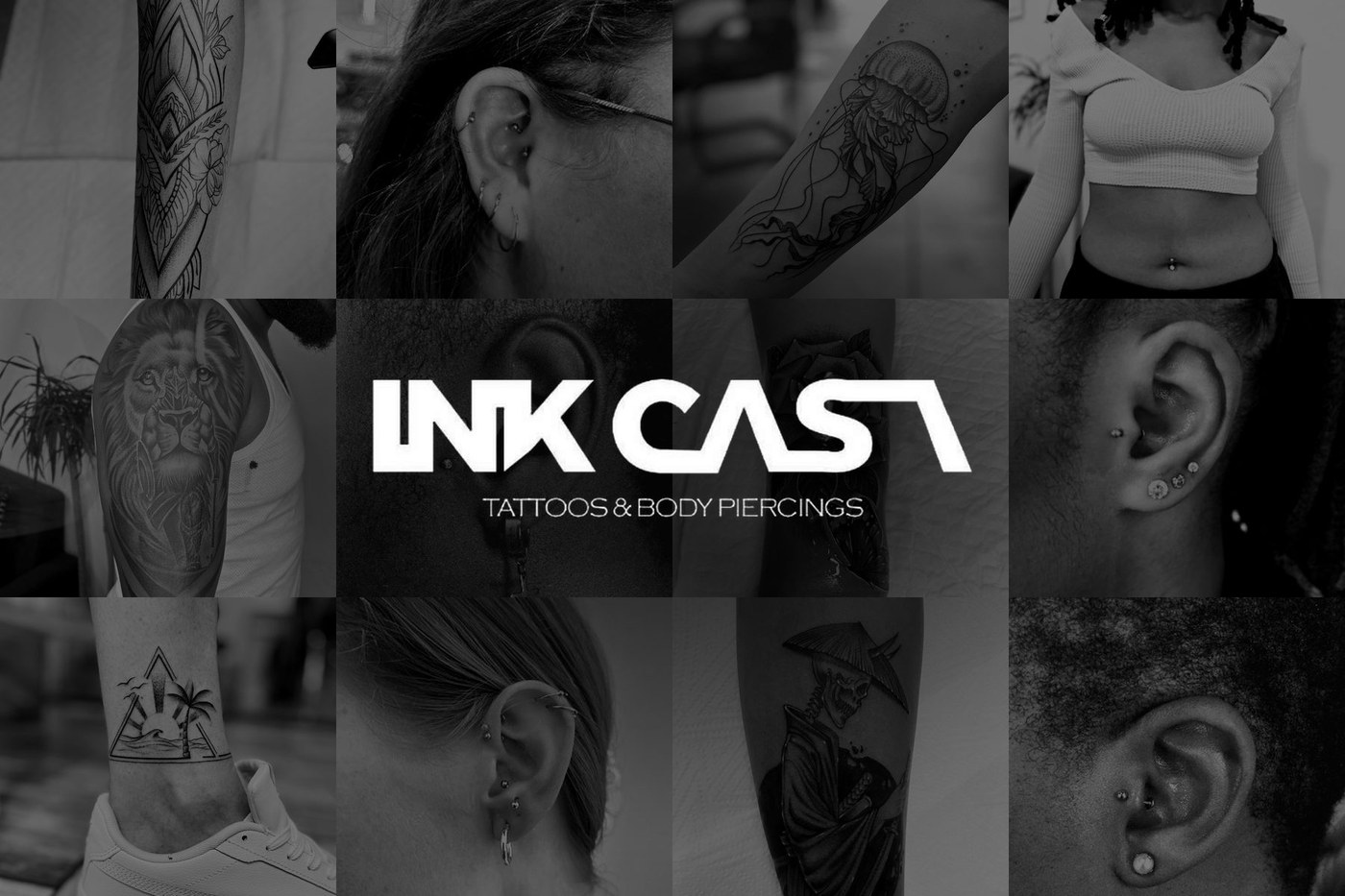
Ink Casa Studios, "The House Of Ink® South Africa", is a tattoo and piercing studio in Menlyn Park Shopping Centre, Pretoria. I designed and built its website from the first conversation with the owner to the finished pages: the structure, the identity, every screen and the code behind them.
“Art is not what you see, but what you make others see.”
The quote that opens the studio's home page
The Challenge
A tattoo studio sells trust and taste, and both are judged by looking. The site had to show the work at its best, introduce the artists and make the studio easy to find. Most visitors would arrive from Instagram or the mall, on a phone, with a few seconds of patience.
Understanding the Studio
Talking to the owner
I spoke to the owner directly to learn what the studio does, who its artists are, how clients find and contact them, and what they wanted a website to do.
Studying the competition
I went through other tattoo studios' websites to see how they show their work, how easy it is to find the address, hours and a quote, and how they behave on a phone.
Design Goals
Four goals. Every decision after this traces back to one of them.
Show the work first
Photos do the selling. Every page frames the tattoos and piercings and then gets out of the way.
Get people through the door
The call to action is "Walk in or message us". The address, hours and a way to message are always a tap away.
One look, strictly monochrome
Black, white and greys only, so the artwork supplies all the colour.
Easy to grow
A clean structure that can take a shop, booking or a content editor later without a redesign.
Planning the Structure
I organised the site around the questions a visitor asks in order: what does the work look like, who does it, how do I get a quote, and where is the studio. That became five pages.
What is on each page
Every page also has a footer with the opening hours and contact icons.
Visual Identity
Black, white and greys, with a tall condensed heading font for the poster-like feel of a tattoo studio and a clean text font for reading.
Barlow Condensed
Walk in or message us
Inter
Tattoos, piercings and cover ups from the house.
The studio's photos come from different phones, lighting and skin tones, so together they can look scattered.
Black and white on the home page, colour in the gallery, and a strict monochrome interface around both.
Black and white makes the home page one consistent set. In the gallery, colour matters because clients judge healed ink and jewellery by it.
Designing the Key Moments
Home: set the tone and give a next step
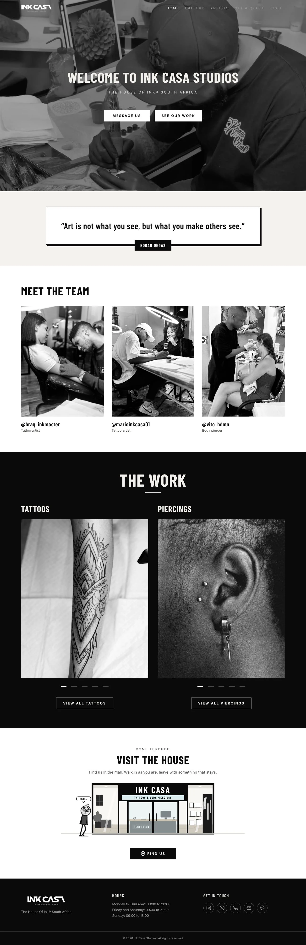
Each page scrolls on its own. Hover to pause, tap to enlarge.
The first screen must say what the studio is and what to do next, within seconds, for someone arriving from Instagram or the mall.
A video header with "Message us" and "See our work", then a quote, the artists, a tattoo slideshow, a piercing slideshow and a "Visit the house" section.
Moving footage gives the page energy and the buttons give a next step. Splitting tattoos and piercings lets each visitor find their own work.
Gallery: browse a lot without a wall of sameness
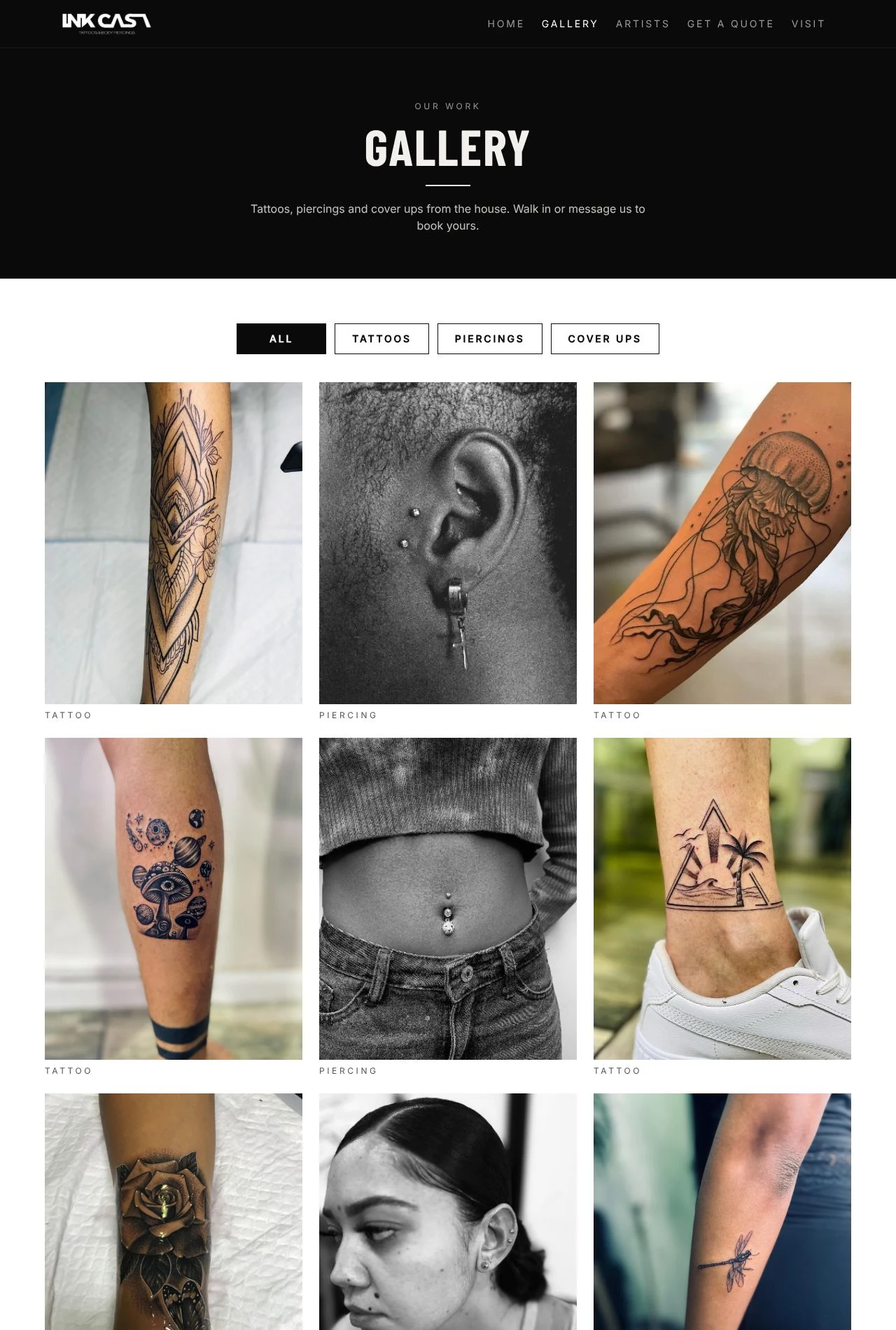
Dozens of photos have to stay easy to scan, and a client has to find the kind of work they care about.
Filter by type, with an "All" view that mixes the types, a small label under each photo and a before and after slider for cover ups.
A client knows what they want done before they care who does it. Mixing piercings among the tattoos keeps the grid varied, and a cover up only makes sense when you can see what it replaced.
Artists: introduce the people behind the work
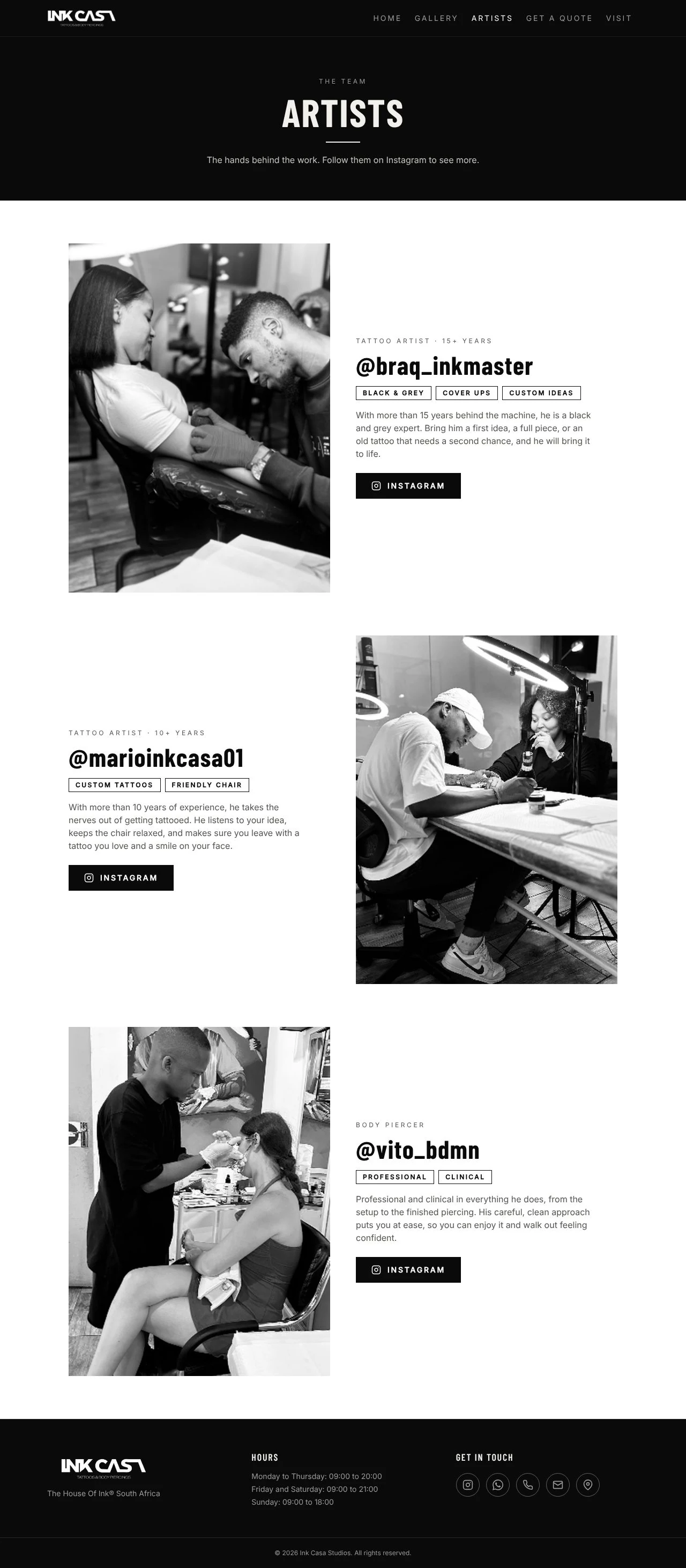
Getting a tattoo is personal, and a nervous client wants to feel comfortable with the artist before walking in.
Each artist appears by handle, with a role, years of experience, a few tags, a short bio and an Instagram button.
The handle is how clients already know and follow each artist. Tags and years help a client pick fast, and short bios keep the tone friendly.
Get a quote: the right details, in the studio's channel
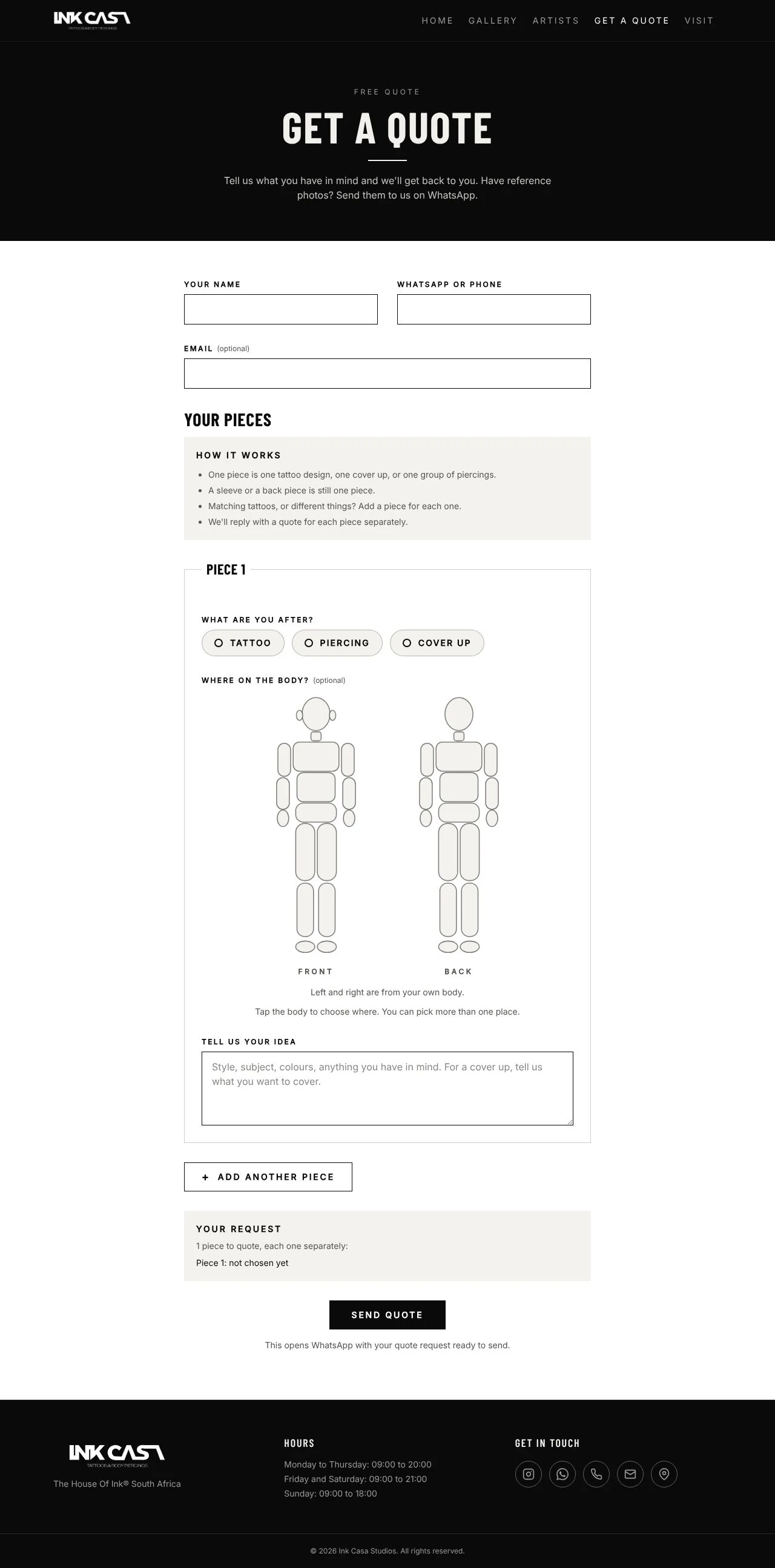
The studio needs enough detail to quote, clients often want more than one thing in a visit, and the studio does its talking on WhatsApp.
A form built around "pieces": choose tattoo, piercing or cover up, tap the body to show where, describe the idea, add another piece, then send the summary on WhatsApp.
The studio quotes each piece separately. A body map is quicker than typing a location, and WhatsApp lets clients attach reference photos in the same chat. A booking system would need availability that isn't settled yet.
Visit: make walking in easy
Walk-ins need the address, the hours and a quick way to reach the studio, without hunting for them.
A Visit page with the address, hours, a map and five equal-size buttons: WhatsApp, call, email, Instagram and directions. The hours and contact icons repeat in the footer on every page.
Equal-size buttons make every way of getting in touch feel equally easy, and the footer means a visitor never has to go looking.
Phone First
Most visitors arrive from Instagram or while standing in the mall, so I designed the phone layout first and then widened it for desktop.
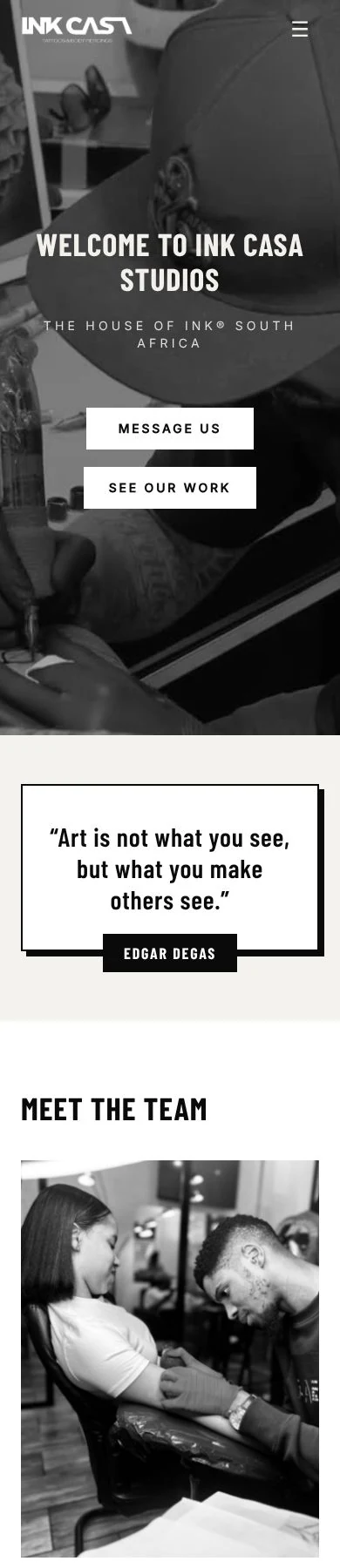
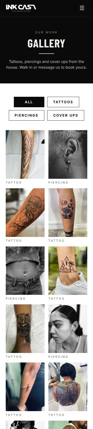
Five navigation links, two slideshows side by side and a body-map form don't fit a small screen as they are.
The menu collapses into one button, buttons go full width, and grids and slideshows become a single column.
Shrunken layouts make tap targets tiny. "Message us" and "See our work" are what a visitor does most, so they must be easy to hit with a thumb.
Decision Log
The big choices on this project, what I weighed up and why I landed where I did.
A showcase site first, not booking or a shop
Considered: a display site, a quote and booking site, an online jewellery shop.
Booking and a shop depend on things the studio still has to settle: payments, a product catalogue and artist availability. A showcase site delivers value straight away, so the rest waits for a later phase.
Work sorted by type, not by artist
Considered: sections per artist, one unsorted grid, filters by type.
Tattoo, Piercing and Cover Up match how a client thinks. The artists have their own page for anyone who wants to start from the person.
Artists shown by Instagram handle
Considered: real names, handles only.
The handle is the name clients already recognise and follow, and it leads straight to more of the artist's work.
Black and white on the home page, colour in the gallery
Considered: colour everywhere, black and white everywhere, a split.
The home page needs to feel unified, while the gallery needs honest colour so clients can judge the work.
Five photos per slideshow, with line markers and no arrows
Considered: every photo, six photos with arrows, five photos with line markers.
Early versions piled up and felt cluttered. A short, chosen set stays tidy and fast, and "View all" leads to the full gallery.
A multi-piece quote form that opens WhatsApp
Considered: a contact form, a booking system, a piece-by-piece quote form.
It matches how the studio quotes and how it already talks to customers, and it needs no backend.
A before and after slider for cover ups
Considered: two photos side by side, a slider.
A slider lets a visitor drag between the two and see exactly what changed. It is built and ready for the studio's first real pairs.
Launch complete, then grow in phases
Considered: everything at launch, a finished site first.
The site is complete as it stands. Easy photo uploads, the first real cover up pairs, a Google Business Profile and later a shop and booking come as separate phases, and the structure already has room for them.
Built to be Found
Page titles and descriptions
Every page has its own, so each one shows up properly in Google and in link previews.
Local search
The studio is described to search engines as a tattoo parlour with its address and hours.
Sitemap and share image
Included, and a missing page shows a friendly 404 instead of an error.
Light photos
Most are under 250 KB, so the gallery stays light on a mobile connection.
Skills Used
UX and information architecture
Turning a visitor's questions into a five-page structure, with the home page previewing each one.
UI and visual design
A strict monochrome identity, a condensed and clean type pairing, and photography-led layouts.
Responsive, phone-first design
A collapsing menu, single-column grids and large tap targets, designed for the phone first.
Front-end development
React, TypeScript and Tailwind CSS: slideshows, a filterable gallery, a before and after slider and a body-map quote form.
SEO and performance
Per-page titles and descriptions, structured data for local search, a sitemap and compressed photos.
Research and client work
Talking to the owner, studying competing studios, and turning feedback into design decisions.
The Result
A bold, fast, monochrome site that lets the work carry the page.
Three artists, a mixed tattoo and piercing gallery, a quote form that works on a phone and a clear way to walk in or message the studio, with room for a shop and booking later.
Visit Ink Casa Studios