
UX Case Study
ChainMail Inc.

Overview & Problem
Overview
ChainMail Inc. is a secure email web client with 80,000 users, known for strong safety, security, and privacy. Despite that reputation, adoption had slowed which is a sign of real usability problems sitting underneath a solid security foundation. As a solo UX case study for my UX/UI design course, I took on the full process: research the problem, redesign the interface, and validate the redesign with real users.
Problem
- Clunky mail formatting tools
- Disruptive security alarms
- An OTP verification step for attachments that added friction
- Frequent auto-logouts that interrupted workflows
- Delays in email delivery features
All of this conflicted with what users actually needed: security that felt effortless, not obstructive.
Stakeholders
Six stakeholders shaped this project, each with a different stake in the outcome; keeping the redesign grounded in real business needs, not just aesthetics.
Project Sponsor
Aligned goals with budget and resources.
Project Manager
Owned scheduling and cross-team coordination.
Technical Developer
Built and secured core functionality.
Visual & Conceptual Designer
Shaped the interface aesthetic.
Sales & Marketing
Tracked user interest and brand perception.
Product Tester
Validated usability and performance before release.
Methodology
A UX roadmap guided the project from initial brief through to prototyping:
Product-Use Context Development
Defining ChainMail's purpose, target users, and technical/physical environment, producing an early usage hypothesis.
Stakeholder Analysis & Objective Prioritization
Building on the six stakeholders above, translating their interests into a ranked list of project objectives.
User Research
Recruitment surveys to select suitable volunteers, plus comparative usability testing for feedback on interactions and pain points.
Hypothesis Evaluation Matrices
Systematically assessing initial assumptions against real user data.
Aesthetic & Functional Design Briefs
Outlining visual standards (colour, typography) and functional requirements for the interface.
Wireframing
Using Balsamiq to build low-fidelity designs for the Inbox, New Mail, and Settings pages.
Interactive Clickthrough Prototype
Tested further with users to evaluate design choices and catch new usability issues.
Research Process & Findings
Research process
Findings
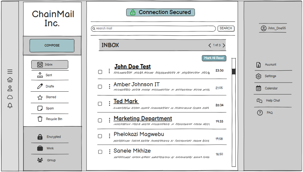
Overall, users valued usability and security equally. They preferred subtle flagging over disruptive alerts, wanted attachment auto-scanning instead of OTP verification, favored manual or longer logout timers over frequent forced logouts, and consistently asked for an "Undo Send" feature. On the interface itself: the "New Mail" button placement wasn't intuitive, the search bar was easy to miss, and folders in the navigation weren't recognizable as folders.
Personas
Thamsanqa Myeni
Tech-savvy, works across laptop and mobile in a hybrid environment. Prioritizes easy-access security features, clear notifications, and a workflow-friendly interface for handling sensitive information.
Diana Dube
Values efficiency but has limited technical skills. Needs a clear, highly readable display and robust protection that doesn't demand technical know-how to use safely.
Wireframes
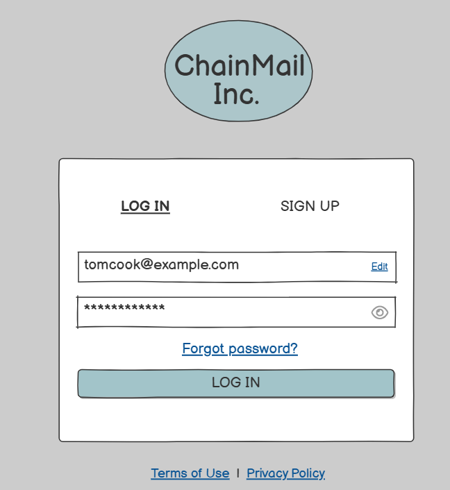
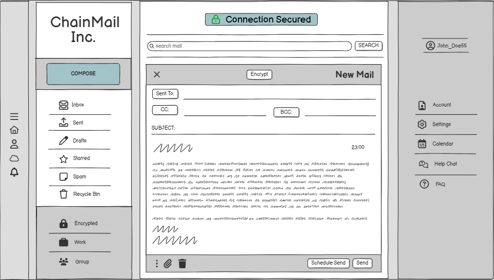
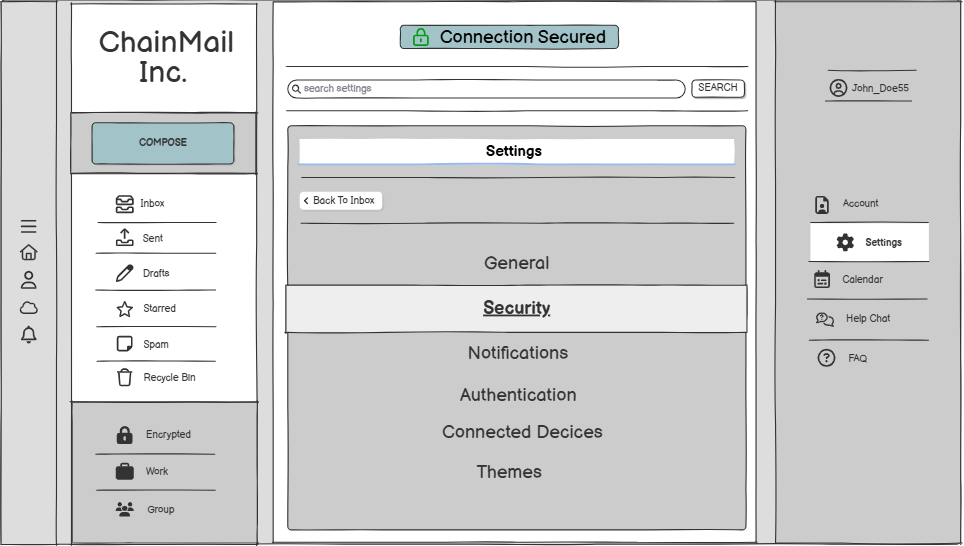
Using Balsamiq, I built low-fidelity wireframes for the core screens — Login, Inbox, New Mail, and Settings — establishing layout and navigation before any visual polish.
Usability Testing & Iteration
Testing the clickthrough prototype with users surfaced three clear issues, each feeding directly into the final design:
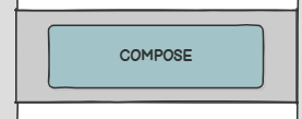
New Mail button
Sat top-right, where users didn't expect it; moved to the top-left, next to the navigation.

Search bar
Blended into the background and went unnoticed; widened it and added a "Search mail" placeholder for clarity.
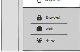
Folder discoverability
Encrypted, Work, and Group folders weren't recognizable as folders; gave them a distinct background so they read clearly as categories.
Recommendations
Closing out the study meant handing off clear, role-specific direction to the people who'd carry the redesign forward:
To the Technical Developer
- Core Functionality: Implement "Undo Send" within a 15-second window; build reliable attachment auto-scanning to replace OTP.
- Security: Auto-encryption on by default but easily togglable; extend auto-logout timers or allow manual lock.
- Search: Make search smarter and predictive, handling complex queries efficiently.
- Feedback: Add subtle, non-disruptive feedback for setting changes and successful actions.
To the Aesthetic Designer
- Visual Hierarchy: Emphasize the New Mail button and search bar through size, colour, and shadow for better discoverability.
- Navigation: Give all interactive elements clear hover states and consistent styling.
- Colour & Typography: Continue the cool-toned grey and teal palette, with bold weights in headings and email lists.
- Consistency: Apply rounded corners and subtle shadows across all interface elements for a cohesive feel.
Solution & Outcome
Solution
The final interface balanced ChainMail's security-first identity with the usability users were asking for: a discoverable New Mail button, a clearly visible search bar, recognizable folder categories, subtle (not disruptive) security alerts, attachment auto-scanning in place of OTP, and an Undo Send option; all within a cool-toned grey and teal palette matching the brand's trust-focused identity.
Outcome
Aligning research findings with concrete interface changes gave ChainMail's technical and design teams a clear, evidence-backed roadmap for the redesign; closing the loop between what users actually needed and what the product delivered.